Hebron and Sage
Brand identity for a luxury real estate agency based in the heart of Nigeria's Federal Capital Territory, dedicated to helping clients acquire, invest in, and experience properties that embody timeless elegance and lasting value.
Project Brief
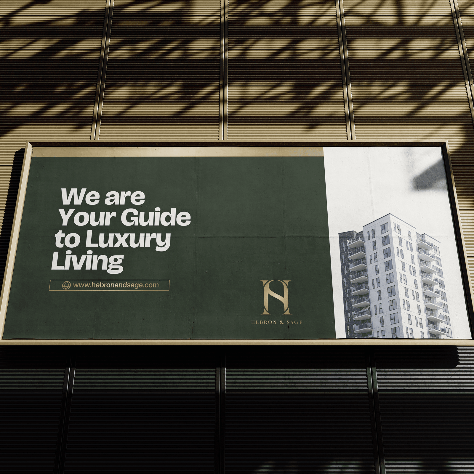
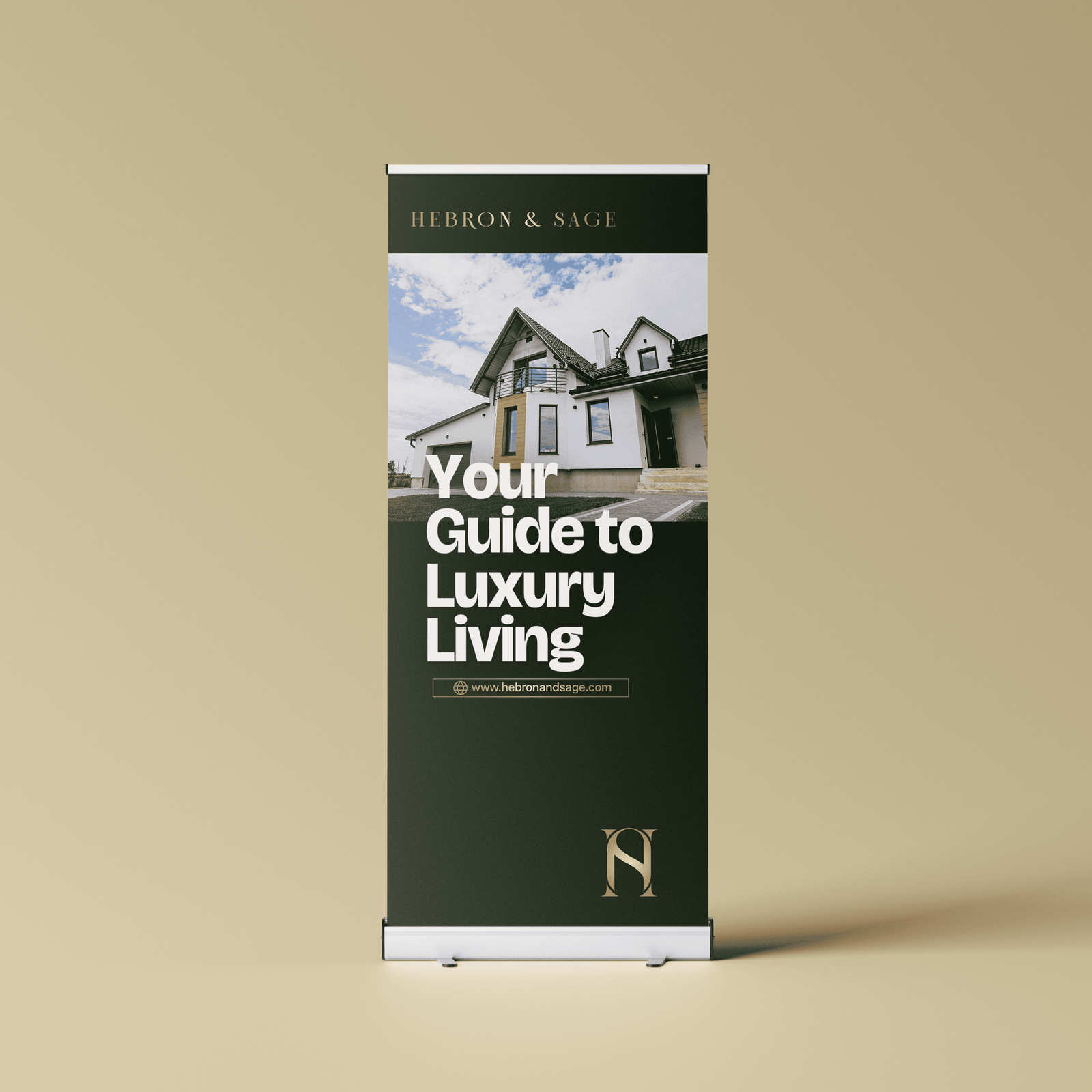
Hebron & Sage is a luxury real estate agency based in the heart of Nigeria's Federal Capital Territory. The brand is dedicated to helping clients acquire, invest in, and experience properties that embody timeless elegance and lasting value. Rooted in the strength of Hebron and the wisdom of Sage, the name reflects a philosophy of legacy, insight, and intentional living.
Our Approach
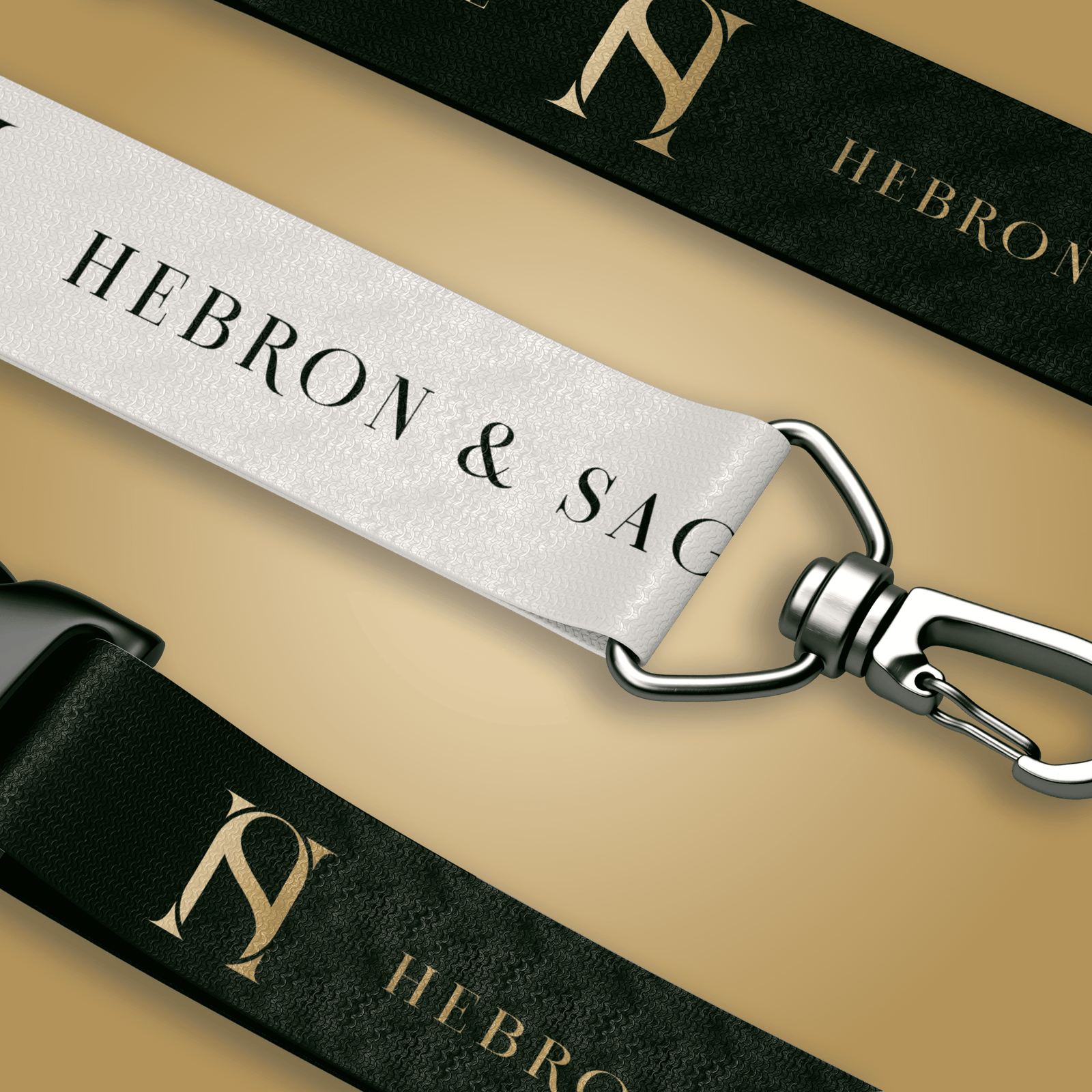
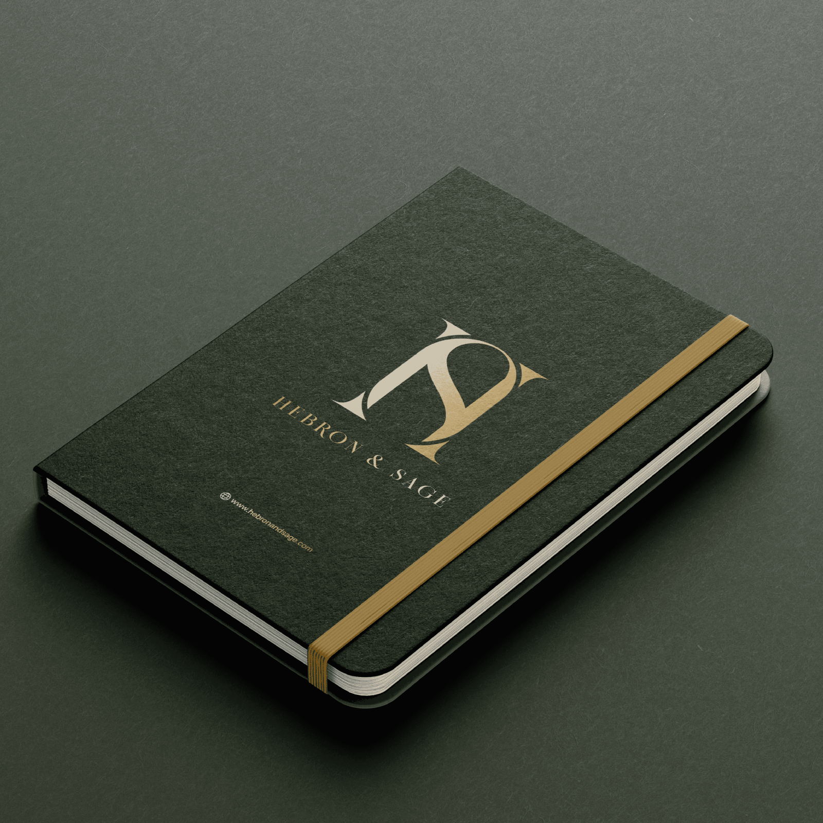
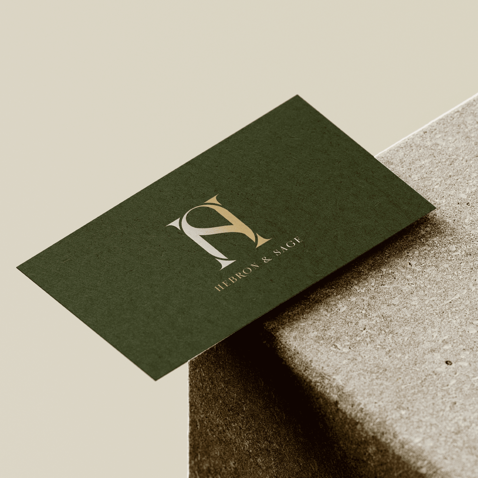
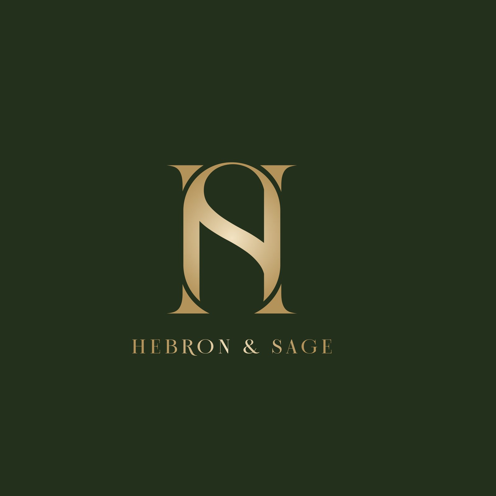
Our approach to the logo design was to create a monogram that merges the letters H and S into a simple yet sophisticated emblem. The form draws inspiration from pillars and architectural symmetry, symbolizing strength, balance, and refinement. The Pillars (H form) represent structure and stability, timeless qualities of enduring architecture. The S Curve (Inner Flow) introduces movement and wisdom, softening the rigidity of the pillars to reflect Sage's guiding insight.
The Result
Encased within an oval frame, the emblem conveys exclusivity and intentional design, mirroring the brand's promise of crafted spaces built with purpose and elegance.
Scope of Work
Brand Strategy, Visual Identity
Project Gallery